Accessibility & Vision · Quick guide
High Contrast and Color Filters: Tuning the Screen for Aging Eyes
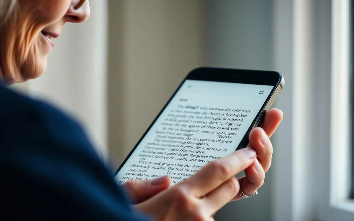
For many of us, the vibrant screens of our smartphones, once a joy to behold, can become a source of frustration as our eyes change with age. But what if I told you there are powerful, built-in tools designed to transform your screen into something much more comfortable to see? Let's explore high contrast and color filters.
For many of us, the vibrant screens of our smartphones, once a joy to behold, can become a source of frustration as our eyes change with age. Small text, subtle color differences, and brightly lit backgrounds can make reading even a simple text message feel like a chore. I've seen it countless times in my 18 years of teaching technology to older adults. But what if I told you there are powerful, built-in tools designed to transform your screen into something much more comfortable to see? Let's explore high contrast and color filters, and how they can make your digital life so much easier.
Why Our Eyes Change (And It's Totally Normal!)
Before we dive into the "how," let's talk a bit about the "why." It's completely natural for our vision to change as we get older. Most commonly, we experience presbyopia, which makes it harder to focus on close-up objects. Many of my students, even those who've never worn glasses before, suddenly find themselves needing reading spectacles for their phones.
Beyond focus, our eyes also become less sensitive to light, and our ability to distinguish between similar colors can decrease. Things like cataracts can make the world seem a bit hazy or less vibrant, while glaucoma can affect peripheral vision. All of these factors can make the "default" settings on our smartphones less than ideal. The good news is, phone manufacturers know this, and they've built in some fantastic accessibility features to help.
Understanding High Contrast: More Than Just Black and White
When I talk about "high contrast" in the context of your smartphone, I'm referring to settings that dramatically increase the visual difference between elements on your screen. Think of it like this: instead of a light gray button on a slightly darker gray background, you'd see a bold black button on a crisp white background. This makes it much easier to distinguish shapes, text, and interactive elements – like buttons and links – from their surroundings.
It's not just about making things stark black and white, though that's often part of it. High contrast features can also:
- Outline interactive elements: Making buttons, text input fields, and links stand out with a distinct border.
- Darken backgrounds: Sometimes a truly black background with white text is easier on the eyes than a bright white screen.
- Boost text clarity: Ensuring text isn't lost against busy or subtly colored backgrounds.
Last Tuesday, a 78-year-old reader emailed me, explaining that she often struggled to tell where one section of an app ended and another began. "Everything just blends together, Suzy," she wrote. "I know there's a button there somewhere, but I can't seem to find it!" This is precisely where high contrast settings can be a game-changer. They provide those clear visual cues that were once there, but perhaps have faded for aging eyes.
High Contrast on Your iPhone (iOS 17/18)
Apple has always been at the forefront of accessibility, and current iPhones running iOS 17 or 18 offer excellent high contrast options. Here's how to find them:
- Tap the Settings app (it's the one with the gear icon).
- Scroll down and tap Accessibility.
- Under the "Vision" section, tap Display & Text Size.
- Here you'll find several helpful switches:
- Bold Text: This is a simple yet powerful change. It makes all the text on your iPhone display thicker and darker. Many people find this alone makes a huge difference.
- Increase Contrast: This option tries to improve the color contrast between app foreground and background colors. It can make buttons and other interface elements stand out more.
- Differentiate Without Color: This is particularly useful if you have difficulty distinguishing items based solely on color. It adds alternative indicators (like shapes or text) for things that might otherwise rely only on color to convey information. For example, a red "X" to close something might get a clearer border.
- Reduce Transparency: This reduces the translucent, "frosted glass" effects often seen in menus or notifications, replacing them with more solid, opaque backgrounds that are easier to discern.
I always recommend starting with "Bold Text" and seeing how that feels. Then, go back and try "Increase Contrast." You don't have to enable everything at once! Experiment to find the combination that works best for your eyes. Remember, if you're also struggling with text size, you can find options in the same "Display & Text Size" menu on your iPhone to adjust that as well. For a deeper dive, check out my article on How to Make Text Bigger on iPhone.
High Contrast on Your Android Phone (Android 14/15)
Android, being an open-source system, means the exact menu paths can vary a little depending on your phone's manufacturer (Samsung, Google Pixel, OnePlus, etc.) and its Android version (say, Android 14 or 15). However, the core features are generally in the same place. Here's the common route:
- Open the Settings app (usually a gear icon or a wrench).
- Scroll down and tap Accessibility.
- Look for sections like Vision or Display within Accessibility.
- You'll typically find options such as:
- High contrast text: This boosts the color contrast of text against its background, making words clearer and easier to read. It often adds a dark outline to white text or a light outline to dark text.
- Dark theme / Dark mode: While not strictly a "high contrast" setting, enabling dark mode (which gives you white text on a black background) can create a very high contrast environment that some people find significantly more comfortable, especially in low light. You can usually find this under Settings → Display, not just Accessibility.
- Remove animations / Reduce animations: Some Android phones offer this, and while it doesn't directly affect contrast, it can make the interface feel less busy and easier to process for some users.
If you have a Samsung phone, for example, you might go to Settings → Accessibility → Visibility enhancements, where you'll find options like "High contrast fonts," "High contrast keyboard," and "Color inversion."
Google Pixel phones (running Android 14/15) have similar options under Settings → Accessibility → Color and motion, where you can toggle "High contrast text."
Again, take your time to explore these settings. Turn one on, see if you like it, and then try another. What works wonderfully for one person might feel too stark for another. It's all about personal preference and what makes your individual screen experience more comfortable.
Beyond Contrast: Color Filters to the Rescue
High contrast focuses on the borders and distinctness of elements. Color filters, on the other hand, are designed to help people who have specific types of color blindness or who find certain screen colors irritating or difficult to distinguish. Imagine if all the blues on your screen looked too much like greens, or if reds and browns were indistinguishable. Color filters can adjust the entire color palette of your screen to compensate for these perceptions.
There are different types of color blindness, and phone manufacturers have included filters that address the most common ones:
- Protanopia/Protanomaly (Red-Green Color Blindness - weaker red perception): Filters make reds and greens easier to differentiate.
- Deuteranopia/Deuteranomaly (Red-Green Color Blindness - weaker green perception): Similar to protanopia, but tailored for green weakness.
- Tritanopia/Tritanomaly (Blue-Yellow Color Blindness): Less common, but filters exist to help differentiate blues and yellows.
You don't necessarily need to know which type of color blindness you have to benefit. Many people who simply find certain color combinations hard on their eyes, or suffer from eye strain, can benefit from subtly shifting the screen's hues. Sometimes just a slight tint, like a warm yellow overlay, can make a screen much more pleasant to look at for extended periods.
One gentleman in my class, Mr. Henderson, mentioned he always struggled with apps that used a lot of bright blues. "It just feels... jarring," he explained, "and after a few minutes, my eyes feel tired." We tried a blue/yellow filter on his Android phone, and while it didn't completely remove the blue, it softened it significantly. He was amazed at how much more comfortable his phone was to use after that simple adjustment.
Applying Color Filters on Your iPhone (iOS 17/18)
iPhones offer a robust set of color filter options, and they're easy to test out:
- Go to Settings.
- Tap Accessibility.
- Under "Vision," tap Display & Text Size.
- Scroll down and tap Color Filters.
- Toggle the Color Filters switch to the "On" position.
- You'll immediately see several options appear:
- Grayscale: This removes all color, displaying everything in shades of black, white, and gray. Some people find this significantly reduces eye strain, especially those sensitive to bright colors.
- Red/Green Filter (Protanopia): Adjusts colors for a common form of red-green color blindness.
- Green/Red Filter (Deuteranopia): Another adjustment for red-green color blindness.
- Blue/Yellow Filter (Tritanopia): Adjusts colors for blue-yellow color blindness.
- Color Tint: This is a fascinating and often overlooked option! If you don't have a specific type of color blindness but find certain colors harsh, you can apply a general tint to the entire screen.
When you select "Color Tint," you'll see two sliders: Hue and Intensity. Play around with these! By moving the Hue slider, you can shift the overall color of your screen (for example, making everything slightly warmer or cooler). The Intensity slider controls how strong that tint is. A subtle yellow tint can mimic the effect of blue-light-blocking glasses without needing a physical accessory.
Just like with high contrast, don't be afraid to experiment. Turn on "Grayscale" for a bit, then try a "Color Tint." You can always switch them off if they don't feel right. For other ways to optimize your iPhone, you might find my article iPhone Setup for Seniors: Getting Started with Ease helpful as well!
Applying Color Filters on Your Android Phone (Android 14/15)
Android's color filter options are also quite comprehensive, though their location might vary slightly. Here's the general path:
- Open Settings.
- Tap Accessibility.
- Look for a section related to Color correction or Color and motion (on Pixel phones) or Visibility enhancements (on Samsung phones).
- Tap Color correction (or similar setting).
- Toggle the Use color correction switch on.
- Beneath it, you'll typically find options like "Correction mode." Tap this to choose your filter:
- Deuteranomaly (red-green)
- Protanomaly (red-green)
- Tritanomaly (blue-yellow)
- Grayscale (often found directly in the main "Color correction" menu or nearby)
On some Android phones, you might also find a "Color inversion" option, which flips all colors (white becomes black, black becomes white, etc.). While this creates extreme contrast, it can sometimes make photos and videos look very strange, so use it with discretion.
On Samsung phones, under Settings → Accessibility → Visibility enhancements, you'll find "Color inversion" and "Color adjustment." Tapping "Color adjustment" lets you choose from different filter types similar to what Apple offers, including various red-green and blue-yellow corrections, and even a fully customizable "Personalized color" option where you can fine-tune things further. This level of customization is truly impressive.
Quick Tip: Adding a Shortcut
Many iPhones and Android phones allow you to add an "Accessibility Shortcut" to quickly toggle these features on and off without digging through menus. On iPhone, this is under Settings → Accessibility → Accessibility Shortcut. On Android, you often configure this in Settings → Accessibility → Accessibility button (or shortcut), allowing you to quickly enable or disable features like color correction with a tap.
Making these adjustments to your smartphone's screen can truly transform your experience. What once felt blurry, faint, or painfully bright can become crisp, clear, and comfortable. Don't underestimate the power of these built-in tools. Spend a little time in your phone's settings, and you might just discover a whole new world of clarity. It's not about settling for less; it's about tuning your technology to truly serve your aging eyes.
Watch & learn
Recommended video: Android Accessibility Settings Explained
A companion tutorial from Android. We link to a YouTube search so you always get a current, working version.
Watch “Android Accessibility Settings Explained” on YouTubeOpens a YouTube search in a new tab · AndroidKey takeaways
- As we age, vision changes like presbyopia, reduced light sensitivity, and decreased color distinction are normal and can make smartphone screens harder to see.
- High contrast settings on smartphones increase the visual difference between screen elements, making text, buttons, and links more distinct and easier to find.
- On iPhone (iOS 17/18), access high contrast settings via Settings → Accessibility → Display & Text Size to find options like Bold Text, Increase Contrast, and Differentiate Without Color.
- On Android (Android 14/15), high contrast text is usually found under Settings → Accessibility → Vision/Display, alongside options for Dark theme.
- Color filters help compensate for color blindness (like red-green or blue-yellow) or make screens more comfortable for those sensitive to certain hues.
Frequently asked questions
- What's the difference between high contrast and dark mode?
- High contrast specifically makes text and interface elements stand out more against their backgrounds, often by adding borders or changing specific element colors. Dark mode primarily inverts the color scheme so you have light text on a dark background, which inherently creates high contrast but is a broader change.
- Will using high contrast or color filters affect my phone's battery life?
- Generally, no. These are software adjustments to how colors are displayed, not hardware changes that would significantly impact battery consumption. If anything, a dark mode (which is a form of high contrast) can actually save a tiny bit of power on phones with OLED screens because black pixels are turned off.
- Can I use both high contrast text and color filters at the same time?
- Yes, on both iPhone and Android, you can typically enable both high contrast text/interface options and color filters simultaneously. Experiment with combinations to find what provides the most comfortable viewing experience for you.
- My phone looks strange after applying a filter. How do I turn it off?
- Don't worry! Usually, you can go back to the exact same settings path where you enabled the feature (e.g., Settings → Accessibility → Display & Text Size → Color Filters on iPhone). Just toggle the main switch for 'Color Filters' or 'Color correction' to the 'Off' position. Many phones also offer an Accessibility Shortcut (often by triple-clicking the side or power button) to quickly toggle these features.
- Are these features only for people with diagnosed vision problems?
- Absolutely not! While they are essential for individuals with diagnosed conditions, many people without specific diagnoses find these features make their phones significantly more comfortable and reduce eye strain, especially as vision naturally changes with age.